
In September, one of the new items Microsoft rolled out for Power BI, was a preview version of their Forecasting statistical analysis feature. Since then they have moved the feature out of “preview” and it is readily usable on the Analytics tab on both Power BI desktop and web versions. In this post we will look at the steps to utilize this new feature in Power BI Desktop to add some quick statistical analysis to your visualizations.
What is Power BI Forecasting?
Forecasting in Power BI gives you a quick and simple way to add a predictive forecast to a time series line chart. Power BI Forecasting uses a method called exponential smoothing to come up with its predictions based on a time series dataset. You cannot view or change the actual algorithm, but you can get more of an explanation of how it works on the Power BI Blog – https://powerbi.microsoft.com/en-us/blog/describing-the-forecasting-models-in-power-view/
Dataset
The data set I used for this demo is a collection of “Check-ins” from the beer rating app Untapped. The full dataset had about 800 beer check-ins, but the full dataset is not posted here to protect the innocent. I have a few rows of sample data below, but any time series data should do. The “ExcelNumericDate” column is the MS Excel integer representation of a date, which I had to use as a work around for a problem I’ll explain below. I’m sure there is a better way to do what I needed, but instead of fighting with formats, I just did it this way.
Let’s try to forecast how many beer check-ins I will have in the future based on my check-in data.
| BeerName | ExcelNumericDate | CheckInDate |
| Tripel Karmeliet | 42272 | 9/25/2015 |
| Big Gruesome Chocolate Peanut Butter Stout | 42272 | 9/25/2015 |
| 60 Minute IPA | 42273 | 9/26/2015 |
| Not Your Father’s Root Beer (5.9%) | 42274 | 9/27/2015 |
| Rumpkin (2015) | 42275 | 9/28/2015 |
| Oktoberfest | 42279 | 10/2/2015 |
| 420 Extra Pale Ale | 42284 | 10/7/2015 |
| Samuel Adams OctoberFest | 42287 | 10/10/2015 |
| Corona Light | 42287 | 10/10/2015 |
| 60 Minute IPA | 42292 | 10/15/2015 |
Using Power BI Forecasting
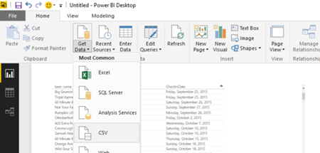
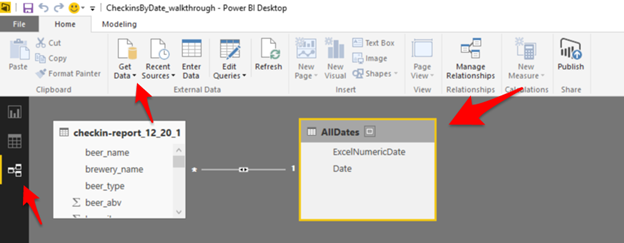
First we need to load our data set into Power BI. As shown below, from the Home tab in Power BI Desktop, select Get Data, and the type of format your file is in. For this demo I used a .csv file that I had saved as a copy of an .xlsx file. You can see I have added two columns, beer_name and CheckInDate to the canvas.
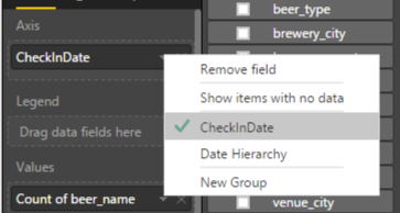
Next, in order to get discrete dates, instead of the default Power BI Date Hierarchy, we need to click on CheckInDate and change the selection from “Date Hierarchy” to the column name, “CheckInDate”.
Now change the Visualization to a Line Chart, and make sure the CheckInDate (or whatever your date field is called) is set as the Axis, and the Count of beer_name is set as the value.
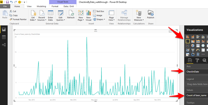
(the huge spikes are tastings at Beer Fests or great brewery tours with Liberty Brew Tours… I swear)
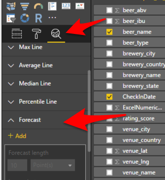
Now we just click on the Analytics magnifying glass, and select the new Forecast option, right?
My Data is too Irregular??
Unfortunately, no. When you click Add, you won’t get anything on your Line Chart except a tiny red “X” in the upper left hand corner. Click on it to get a bit more information.

“Data is too irregular to forecast.” “Your data isn’t evenly spaced … dates or numbers in a valid timeline must have a consistent gap between consecutive points”
After more trial and error than I’d like to admit, I realized what Power BI is telling us is that it can’t create a forecast because it doesn’t have a data point for each date. If we go back and look at the sample data I have above, you can see that on 10/2/2015 the beer Oktoberfest was checked in, and then there was not another check-in until 420 Extra Pale Ale on 10/7/2015.
| Oktoberfest | 42279 | 10/2/2015 |
| 420 Extra Pale Ale | 42284 | 10/7/2015 |
This is where I kind of have to assume I’m missing a way to easily have Power BI just assume a 0 value for any missing dates, but I wasn’t able to find it. This becomes clear if you look at the Line Chart above – there are no data points at 0, only at 1 or greater. An interesting side note, if you “drill up” to the month level with this data, you CAN add a forecast because in that case each month, when all check-ins are summed by month, have values.
My work around for this seemed simple enough, merge in another data set with all possible dates for the date range I wanted for the report, then use the dates from that 2nd data set for the X-Axis so every date in the range would have a data point. Fast forward through a wasted hour fighting with 2 .xlsx files and differing date formats (eg: January 2nd 2017 10:00 AM vs. 1/2/2017 etc…), and I just converted the datetimes in both data sets, beer check-ins and All Dates, to integers in Excel and used that for the join. Ugly, I know.
So we import the 2nd dataset of all possible dates we want and their Excel integer equivalent as shown below.
| ExcelNumericDate | Date |
| 42005 | 1/1/2015 |
| 42006 | 1/2/2015 |
Click on Relationships on the left hand side, Get Data, and select your 2nd data set formatted as above.
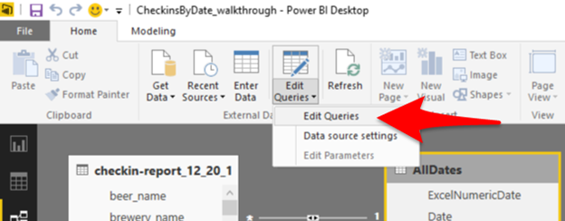
Once we have the 2nd data set with all possible dates, we need to merge (AKA: Join) the 2 data sets. So click on Edit Queries on the ribbon –
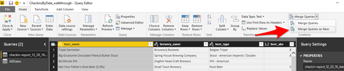
On the Query Editor screen, we go to Merge Queries > Merge Queries as New –
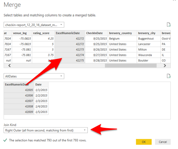
On the Merge dialog box, shown below, we select our Join/Merge key (ExcelNumericDate), and select our “Join Kind”, eg: INNER, LEFT, RIGHT etc… Be careful here to pick the correct type of join, Right or Left, depending on which order the data sets are in.
Now we close out of the Merge dialog box, and just have a couple other small things to do.
Adding Our Forecast
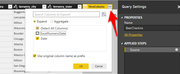
First, in the Query Editor, we can rename our new Query, here I’ve called it BeerCheckins. Then we need to go to the far right of the list of columns to find our new “column”, or rather collection of columns, we “merged” and click the double arrows shown below to expand the new columns. We only care about the Date column now because we will use this for our X-axis. Remember, this is now the date from the AllDates data set so there is one row for each day.
We can then click Close and Apply in the upper left to return to our data, where we are going to add one last column to simplify summing our check-ins. Right click on our new BeerCheckins table, and select New Column.
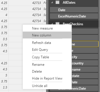
For this new column, named Counter, we want to make sure that every date that does NOT have a check-in (eg: no beer), we have a data point of 0. So we can check the beer_name column to see if there was a check-in on each date using the below DAX function:
Counter = IF(ISBLANK(BeerCheckins[beer_name]),0,1)
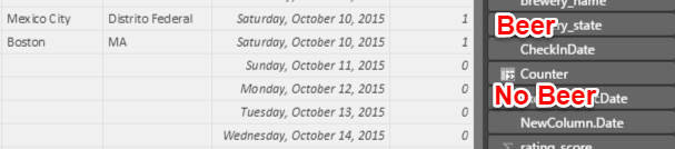
This new column is added to the far right, and has a value of 1 if there was a check-in on that date, or 0 if there was not (*note: though we used the [beer_name] column for the function, it is not shown)
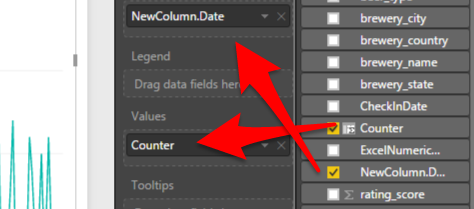
Now we can finally go back to our Report tab, add a new Line Chart, set the NewColumn.Date as the Axis (don’t forget to again toggle off the Date Hierarchy default), and the Counter column as the Value.
Answering the Question
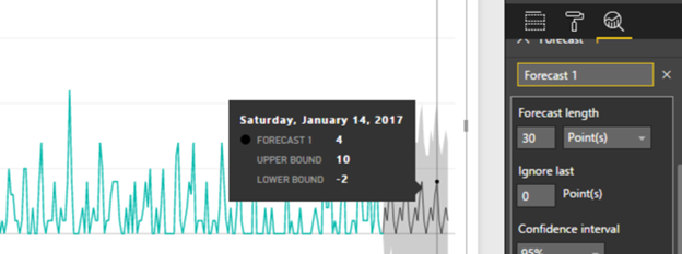
And this time when we go to the Analytics tab and try to add a Forecast – we can create it successfully and we find that within a 95% confidence interval I will, in fact, have 4 beer check-ins on Saturday, January 14th 2017!
Always drink responsibly.